9 LIVES
9LIVES is a brand of locally made hot sauce. They pride themselves in growing their own peppers and making everything from scratch. They are a small business started by a former chef with a passion for the culinary arts, now focused on adding spice to everyday flavors.
The Challenge
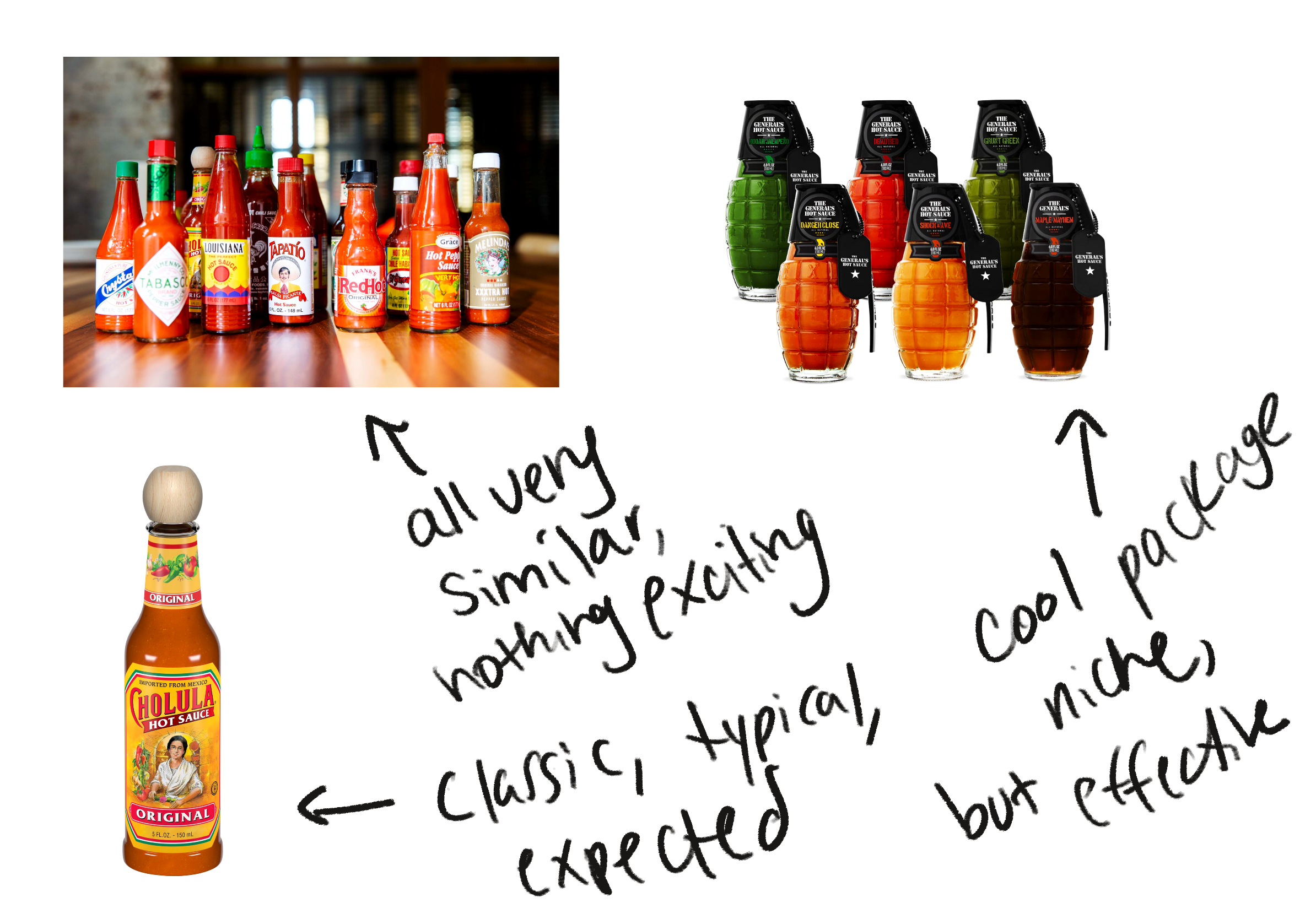
Usually when you look at hot sauce packaging it’s all very aggressive, in your face, with bright reds to signify the spice level and a lot of really bold and outrageous imagery. The client wanted to take a different approach and go with something softer, more pastel and slightly retro because this sauce is inspired by the owner’s cats.
Competition
Cholula
Crystal Hot Sauce
Fly By Jing
Bravado Spice Co.
Valentina
Other grocery store brands
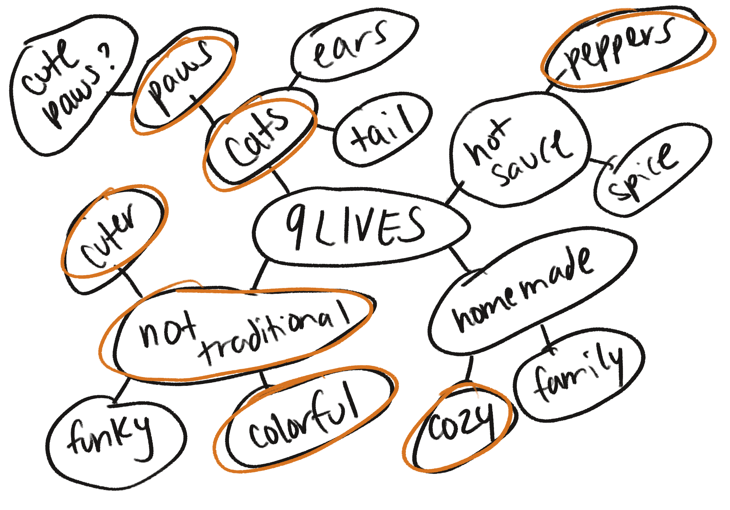
Moodboard
Meet the Cats
LUNA
LYNX
BLAZE
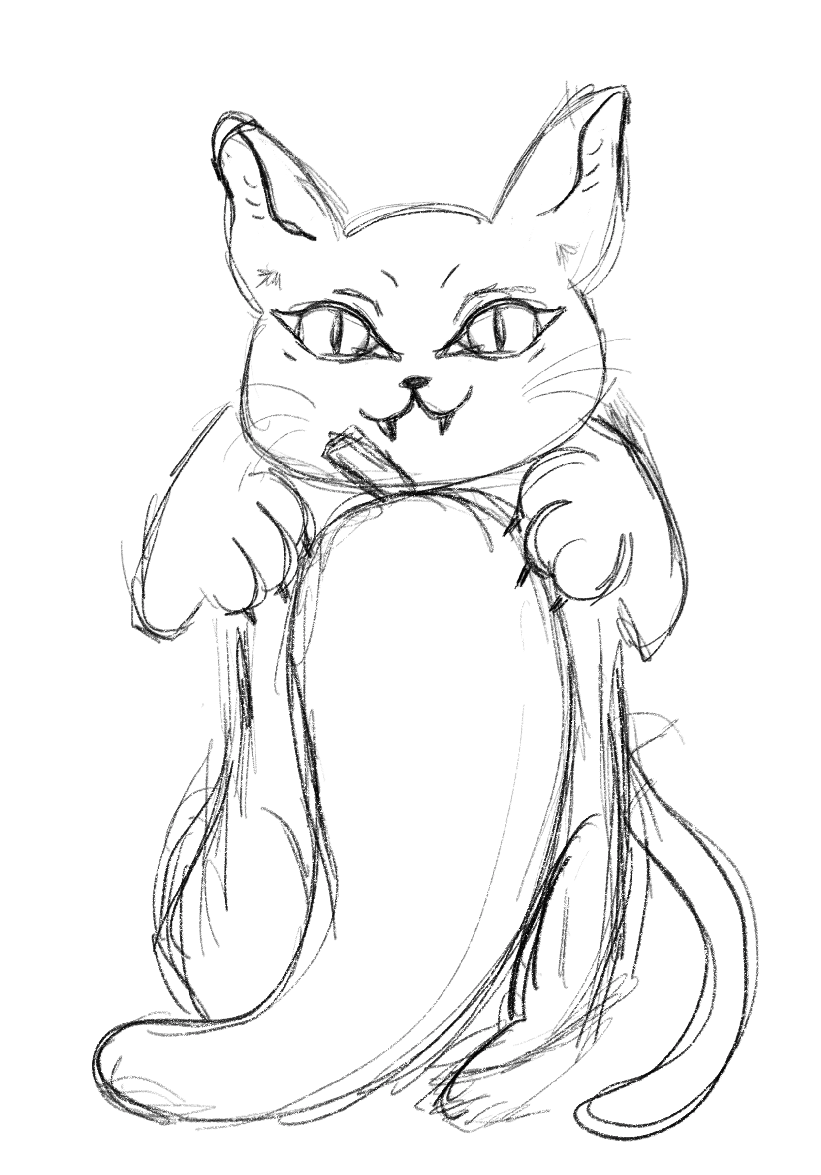
Sketches
Mid-Process Thoughts
I was very intent on using either the cat paws or a full illustration of a cat on the full bottle label. It was proving to be difficult, however, to fit a large illustration while still working around the typography.
The imagery initially was looking cheesy (and not in a good way!) and reminiscent to the current trend of hot sauce on the market with it looking aggressive, which is what we were trying to avoid.
In the end, I chose to pivot the design and step away from the full cat illustration and go with something more subtle.
Final Look
Reflection
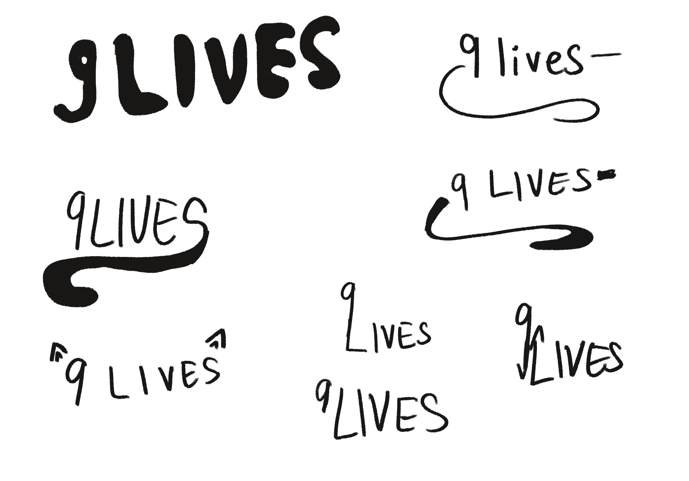
I am very happy with how this came out. I feel like I captured that softer look that the client was aiming for by using a toned down primary color palette. I explored a lot of different type options both with the logo and the rest of the typography on the bottle.
Going forward, a way for the client to branch out and get their brand out there would be to partner with local animal shelters or maybe even host some cat adoption events. They could also donate a portion of their profits to animal shelters to show their support and continue the trend with their own cats.

